PlanBound
Planbound is designed for travelers who want to organize their trips efficiently while staying on budget. It combines the power of financial tracking with itinerary planning, offering users a seamless experience from initial budgeting to booking. The app suggests personalized destinations, activities, and accommodations based on individual preferences and financial goals, making it an essential tool for stress-free travel planning.

Problem
Problem Planning a trip with a limited budget often means juggling numerous expenses like flights, accommodations, and activities. Travelers can easily become overwhelmed by all the variables, and existing apps don’t offer a centralized place to handle budgeting alongside itinerary planning.
Solution
Planbound provides a single app that: -Helps users track their budget and expenses in real time. -Suggests personalized destinations, accommodations, and activities. -Offers integrated booking options to handle all logistics in one place
Data Collection
Interviews: We conducted interviews with frequent travelers to understand their pain points and needs. Key Insights: Many users wanted a tool to track both their budget and itinerary in a seamless, integrated way.
Personas
We developed personas for three primary user groups: budget-conscious travelers, adventure seekers, and business planners. These personas gave us a deeper understanding of the unique needs, goals, and challenges our users face. By using these insights, we tailored Planbound’s features to meet the diverse needs of our target audience, ensuring a more personalized and intuitive user experience. These personas helped guide design decisions and improve user flows to align with real user expectations.
Competitive Research
We conducted research on other travel and budgeting apps like TripIt and Google Trips to understand what works and what doesn’t. While these apps offer basic itinerary and budget management, they lack the seamless integration between the two. Planbound sets itself apart by combining both functions—budget tracking and itinerary management—into a single platform, offering a unique value proposition. By addressing the gaps in the competition, we were able to create a more holistic and user-centric app.
Site Map
We designed the sitemap to clearly organize all key sections of the app, ensuring intuitive navigation for users. The sitemap includes sections such as "Budget Overview," "Itinerary Planning," and "Travel Insights." By mapping out the app’s structure, we ensured users can easily access features based on their priorities, from budgeting to tracking progress on their trip plans.
Task Flow
The task flow outlines the key steps users take to complete core tasks in the app, such as creating a trip, setting a budget, and tracking expenses. Each flow is streamlined to reduce complexity, making it easy for users to quickly achieve their goals. By breaking down the flow into clear actions, we ensured a user-friendly experience from start to finish.
Sketches
We began with low-fidelity sketches to quickly visualize the layout and structure of the app. These sketches helped us identify potential issues early, refine the layout, and prioritize essential features. We iterated on these early designs, ensuring that the interface would be functional while also providing a smooth experience for users.
Wireframes
Using Figma, we developed low-fidelity wireframes that incorporated feedback from early sketches. The wireframes served as the foundation for our design, allowing us to test the layout and functionality before moving to high-fidelity designs. They focused on key user interactions, like adding budget categories and tracking progress within the app.
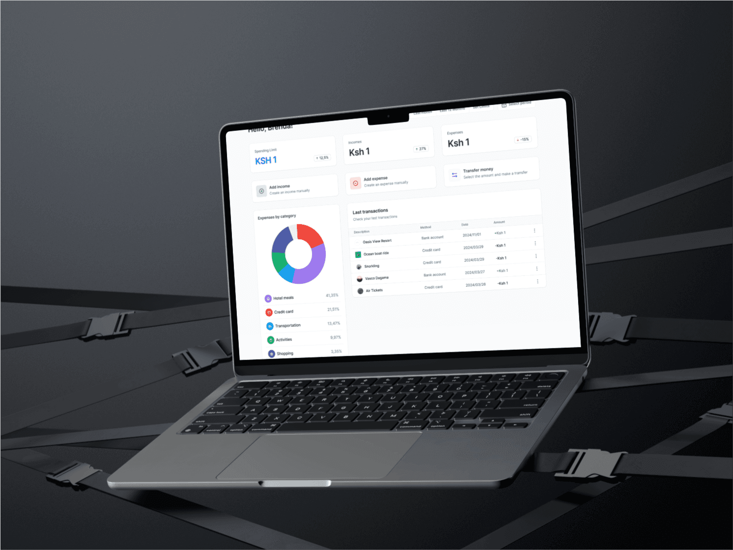
Hi-Fi and First Prototype
Our first prototype incorporated feedback from user testing and refined wireframes. We focused on creating clean, functional interfaces with vibrant visuals that made the budgeting and itinerary features stand out. The prototype allowed us to test the app’s flow and interactions in a real-world scenario, ensuring the app's usability and design aligned with user needs.
Style Tile
The style tile established the visual direction for the app, including typography, color palette, and branding elements. We selected a modern, minimalist aesthetic with a calm color palette to evoke trust and clarity. The typography was chosen for readability, ensuring that users can easily navigate through the content-heavy sections of the app without feeling overwhelmed.

Userbility Testing overview
Usability Testing Overview We tested the app prototype with 5 participants who were seasoned travelers. Most users appreciated the simplicity of budgeting and itinerary creation but expressed a desire for more flexibility in adjusting the budget during the trip. Changes Made We added an “edit budget” feature for real-time budget adjustments. Increased customization options for building itineraries based on specific user preferences.
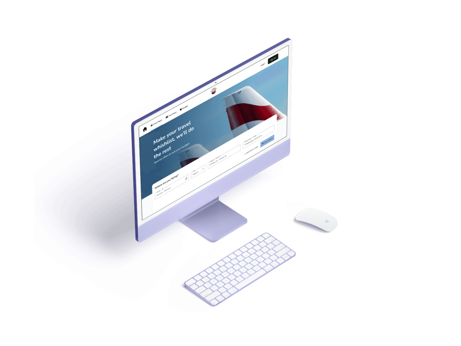
Ui Design
In Figma, we designed high-fidelity screens with a focus on simplicity and user-friendliness. Following Material Design principles, we ensured consistency across different devices. The UI design prioritized intuitive navigation, seamless integration of itinerary and budgeting tools, and responsive layouts. By maintaining clarity in visual hierarchy, we provided users with a satisfying and frictionless experience.