School Scout
School Scout is an educational app designed to simplify and personalize the school search process for users. It caters to parents, students and individuals involved in finding and comparing schools. Weather users are looking for new school placements, tranferring or seeking school resources, the app streamlines this jpourney into a tailored and accessible experience.


Problem
Finding the right school for children or oneself can be overwhelming and fragmented, with countless sources providing varying or incomplete information. Users struggle to find centralized, comprehensive school data that can match their specific needs—be it academic performance, location, or affordability. This process is often inefficient, leaving users frustrated and uncertain.
Solution
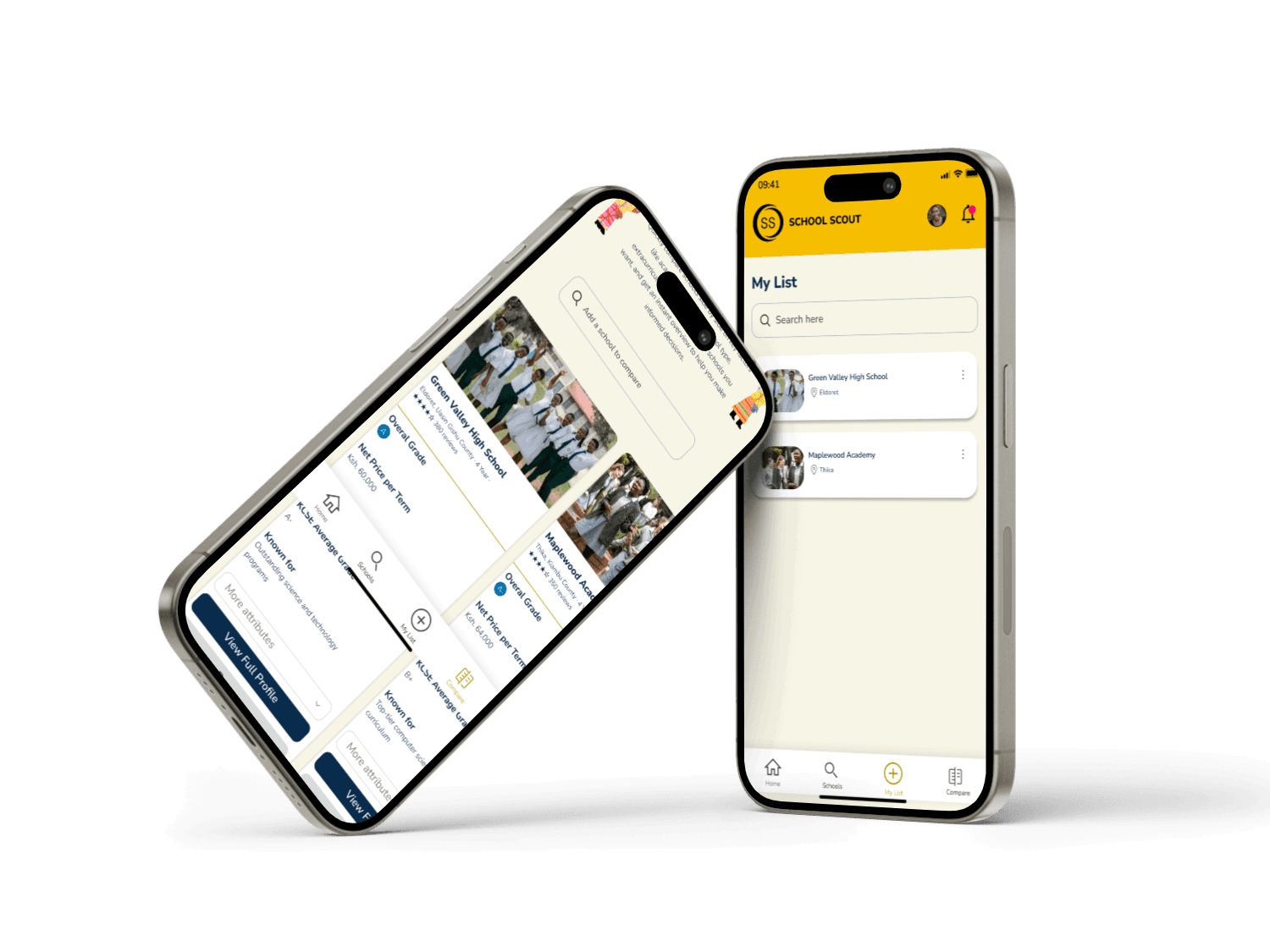
School Scout addresses these issues by offering a personalized, centralized platform for school research and comparison. The app curates school suggestions based on user preferences gathered during onboarding, ensuring users receive tailored recommendations. The school comparison tool allows for an in-depth analysis based on criteria like tuition fees, performance metrics, and location.
Data Collection
I conducted interviews with parents to understand their pain points, such as fragmented information and difficulty in making meaningful comparisons. For example, Catherine Wang, a working mother, emphasized the need for accurate and time-saving recommendations.
Personas
In this case study, personas played a critical role in developing an empathetic, user-centered design. We created four distinct personas for each user segment to gain deeper insight into our users' goals, needs, experiences, and behaviors. This was essential to step outside our assumptions and challenge our initial ideas. Why We Needed Personas Personas allowed us to understand user motivations, anticipate pain points, and design solutions that fit actual user contexts. They became reference points for aligning our design with real user challenges. Impact on the Design Process -The personas directly influenced our design choices by helping us: -Prioritize features that addressed the most common needs across user segments. -Shape user flows that aligned with specific tasks or pain points. -Make UI decisions to enhance accessibility and usability based on each persona's tech-savviness and constraints. Overall, personas were essential in crafting an app experience that resonated with users and addressed their specific needs.
Competitive Research
I conducted a comparative study of existing platforms such as GreatSchools, Niche, and Private School Review. -GreatSchools: Offers school ratings and reviews but lacks personalization in search recommendations. -Niche: Provides user-based reviews and detailed insights but requires substantial user input for results to be meaningful. -Private School Review: Focuses primarily on private schools, with limited scope for users looking for public or other types of schools School Scout differentiates itself by offering personalized recommendations based on user input during onboarding, and an intuitive comparison tool that allows users to compare multiple schools on specific criteria like tuition, proximity, and performance. The user-centric approach and holistic data access set School Scout apart from these more static, information-heavy platforms.
Site Map
The School Scout site map provides an organized overview of the app’s key sections. This structure is designed to make navigation intuitive, allowing users to find relevant information, explore personalized recommendations, and efficiently access each tool and feature within the app.
Task Flow
The task flow for School Scout outlines the essential actions users will take to accomplish their main goals. By detailing steps like creating a profile, searching and comparing schools, and saving or contacting selections, the task flow emphasizes a streamlined experience, ensuring users can easily achieve each objective.
Sketches
Low-fidelity sketches helped visualize the app’s structure while prioritizing simplicity and functionality. Early sketches highlighted the primary flow from search to comparison, minimizing distractions. Key Sketch Outcomes: -Addressed potential pain points identified in research. -Iterated designs for streamlined navigation. -Focused on decluttering user interactions to meet goals.
WireFrames
Using Figma, I created low-fidelity wireframes that incorporated feedback from early sketches. -Added placeholder images and content to simulate real usage. -Conducted 4 user tests, leading to adjustments in layout and navigation. -Iterated the wireframes based on user feedback before progressing to high-fidelity designs.
Hi-Fi & First Prototype
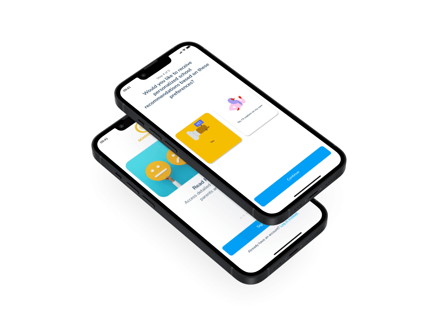
The polished prototype featured clean layouts, an intuitive flow, and vibrant visuals that aligned with user expectations. It included the following: 1.Personalized Onboarding Flow: Gather user preferences seamlessly. 2.Dynamic Comparison Tool: Compare multiple schools with side-by-side metrics. 3.Save and Organize: A section to revisit shortlisted schools.
Style Tile
Logo, Typography, and Color Palette -Logo: Reflects the theme of education and trust. -Typography: Chose clean, modern fonts for readability. -Color Palette: A calming and professional combination of blue and green, signifying trust and growth. Design Choices I adhered to Material Design principles for consistency across platforms, ensuring accessibility for users on different devices.

Usability Testing Overview
I conducted usability testing on the high-fidelity prototype with 7 participants across two rounds. Key Issues Identified: -Overloaded Comparison Tool: Too many metrics displayed at once overwhelmed users. -Onboarding Clarity: Some users found the onboarding flow unclear. Solutions Implemented: -Reduced the number of comparison metrics displayed at a time; users can toggle to view more details. -Simplified the onboarding questions and provided a progress indicator to improve clarity.
UI Design
In Figma, I created final screens with a clean, modern design aligned with the brand’s values of simplicity and trust. I followed Material Design for consistency and accessibility across iOS, Android, and web platforms. The design focuses on personalization, easy navigation, and efficiency, ensuring users can quickly compare schools with clear, trustworthy information.